Improving fabric sales through cluster analysis
 Photo by Choong Deng Xiang on Unsplash
Table of Contents
Abstract
We performed cluster analysis and regression on our fabric sales data. Due to the subjective nature of fabric, the features we extracted were not enough to make precise predictions. However, leveraging the results from cluster analysis has improved our sales in two ways:
First, by providing labels for each cluster, we have given buyers a more organized way to make purchases, resulting in a 50% reduction in processing time for each purchase.
Second, by identifying the clusters that may lead to high inventory levels, we can allocate our budget more effectively, resulting in up to a 4x improvement in sales.
1. Introduction
Understanding customers’ needs is one of the key strategies to increase sales. For fabric retailers, this can be particularly challenging due to the subjective nature of fabric as a visual artwork. Each customer may have different preferences, which can result in high inventory levels if purchased fabric does not meet their needs. Additionally, fabric selection has traditionally been carried out by experienced buyers, which can be prone to human error and exacerbate the issue.
To address these issues, we analyze the features extracted from our algorithms$^1$ $^2$ to gain insights into the fabric. This will help us better understand customer preferences and, consequently, improve sales.
2. Objectives
The objective of this project is to:
- Categorize the fabric by features.
- Identify the category with the most sales and the category with the highest inventory level.
- Predict sales.
- Develop a strategy to improve sales.
3. Dataset
Data was collected from the previous quarter’s sales results, including a total of 3000 fabrics. Table 1 lists detailed descriptions of the extracted features and target.
Description of fabric’s features and target.
| Feature | Unit | Type | Range | Description |
|---|---|---|---|---|
| HUE | degree | Numerical | [0, 359] | Hue of the dominant color. |
| PERCENT | - | Numerical | [0, 100] | Percentage of dominant color. |
| RANGE | degree | Numerical | [0, 359] | Range of colors. |
| THEME | - | Categorical | Monochrome, analogous, complementary, triadic, none | Color themes. |
| SIZE | $cm^2$ | Numerical | [0, 1247.35] | Pattern size. |
| CONTRAST | - | Numerical | [0, 127.5] | Standard deviation in grayscale. |
| SALES | - | Numerical | [0, 100] | Percentage of sales. |
Fig. 1 shows an example of a fabric property and its corresponding features. As the purchased quantity of each fabric varies, we use the percentage of sales for each fabric, which is calculated by dividing the total sales at the end of the month by the total purchases at the beginning of the month.
(a) SIZE is the unit size of a repeated pattern. (b) THEME and RANGE are color themes and ranges used in fabric. These are extracted from a color wheel. (c) The CONTRAST is measured as the standard deviation in the grayscale histogram. (d) HUE and PERCENT refer to the hue and percentage of the dominant color.
(a)show hide
(c)show hide
(b)show hide
(d)show hide
4. Exploratory data analysis
4.1. Distribution
We can perform a descriptive analysis by examining the distribution of each feature and its correlation with sales, as shown in the Fig. 2.
The percentage of blue and red is high in the main color (HUE). However, HUE is uncorrelated to SALES in Fig. 3, indicating that our customers have no significant preference for the main color of the fabric. Therefore, we will drop this feature in future analyses.
The RANGE and SIZE of the fabric are relatively small. This is reasonable, as it is difficult to design fabric with a wide color range, large pattern size. Regarding THEME, it is evident that the percentage decreases as the theme becomes more intricate. This makes sense since, similar to RANGE, designing becomes more challenging when there are more limitations on color usage to match the theme.
In terms of SALES performance, the mean is 40% and the distribution is mainly below this mark.
Distribution of features.
HUEshow hide
PERCENTshow hide
RANGEshow hide
SIZEshow hide
CONTRASTshow hide
SALESshow hide
THEMEshow hide
4.2. Correlation
Fig. 3 shows the correlation between SALES and features. Despite the low correlation, all below 0.5, we can still gain some insight into customer preferences.
Correlation coefficient between sales and features.
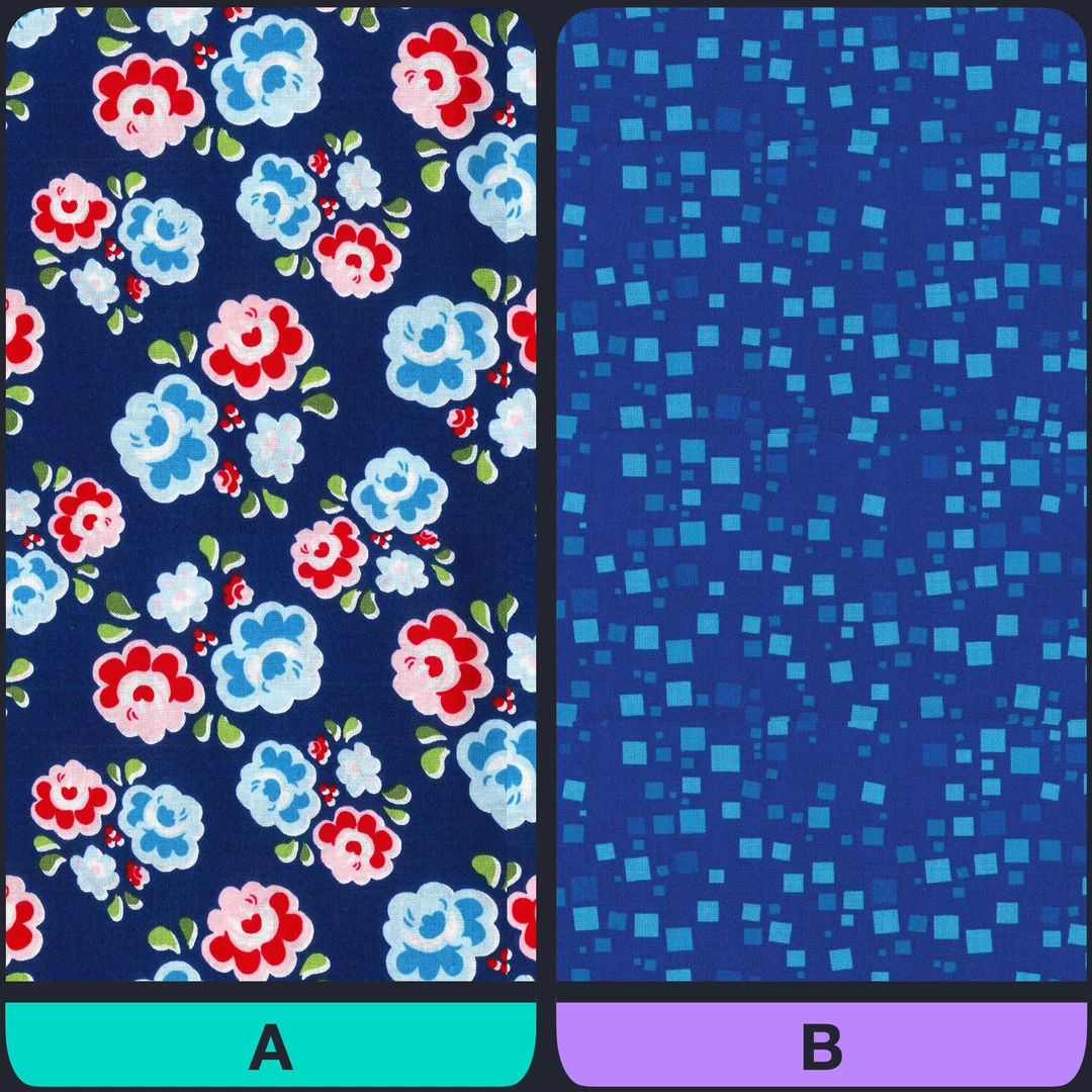
All features, except for PERCENT, monochrome and non-specific color themes, are positively correlated with sales. This result is quite intuitive. Fig. 4 provides an example: Fabric A has a wider range of colors and a larger pattern size, as well as higher contrast. Additionally, it uses a triadic theme to balance red, blue, and green, resulting in higher visual appeal than Fabric B. Therefore, it is reasonable to assume that Fabric A has higher sales than Fabric B.
To illustrate the correlation between sales and features, consider the example of two fabrics, A and B. Fabric A has a wider color range, larger pattern size, and higher contrast, resulting in higher visual appeal than B. Therefore, A is likely to have higher sales than B.
show hide
show hide
5. Models
Before conducting quantitative analysis, it’s important to split the data into training and test datasets. This is necessary for verification in the final step of the analysis. Additionally, data standardization is required to ensure that all features have a comparable range.
5.1. Dimensionality reduction
As there are both numerical and categorical features, the covariance matrix should be treated differently. For numerical features, we can follow the original definition. However, for categorical features, the covariance matrix is constructed by preserving the $\chi^2$ distance between features. Next, we can perform singular value decomposition on the covariance matrix to find the principal components. In summary, PCA (principal component analysis) and CA (correspondence analysis) are utilized to decrease feature dimensionality.
The results are shown in the Fig. 5 (a). We can use three principal components and still preserve 70% of the total variance. The loading of components are also shown in Fig. 5 (b).
(a) Variance explained after dimensionality reduction. (b) Loading of the first five principal components.
(a)show hide
(b)show hide
5.2. Cluster analysis
5.2.1. K-means
After identifying the turning point in the elbow plot, as shown in Fig. 6 (a), we have decided to use 3 clusters for further analysis. For each cluster, we calculate the average of its features as shown in the Fig. 6 (b).
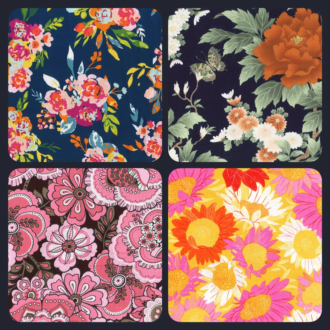
The first cluster, named “Colorful”, has higher values in RANGE, CONTRAST, and multiple color themes. The second cluster, named “Large pattern”, has the highest value in SIZE. In contrast to the first two clusters, the third cluster has only a large positive value in main color percentage (PERCENT) and monochrome color theme, so it is named “Plain” and should be considered less visually appealing than the first two clusters. Fig. 6 (c) provides examples of fabric for each cluster.
(a) Elbow plot of K-means analysis. (b) Naming each cluster based on the average value of its features. (c) Visualize the clusters using the first three principal components and provide an example fabric for each cluster.
(a)show hide
(b)show hide
(c)show hide
Colorfulshow hide
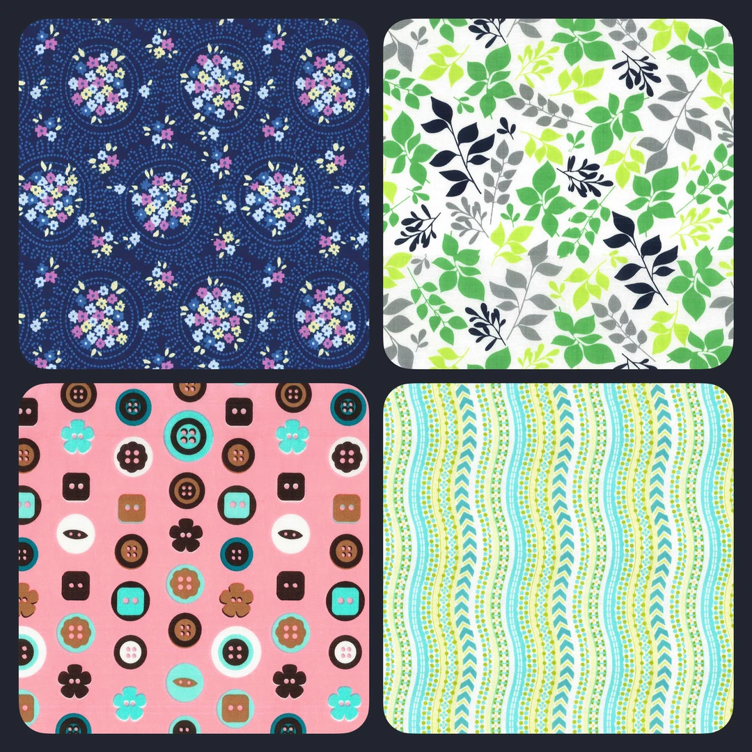
Large patternshow hide
Plainshow hide
5.2.2. Sales and Stock
Fig. 7 (a) displays the histogram and cumulative curve for the percentage of sales. It is clear that the distribution of “Plain” fabric is highly concentrated near zero. The accompanying Fig. 7 (b) illustrates the portion of sales and stock. Although “Plain” fabric constitutes 60% of total stock, it only contributes to 31.9% of sales. In other words, the high inventory level is caused by the excess of “Plain” fabric. Therefore, we can improve our inventory control by reducing the total portion of “Plain” fabric in every purchase. Test data supports this conclusion (not shown).
While “Colorful” fabric has better sales, it also has a higher stock level. Additionally, the histogram and cumulative curve are similar for both “Colorful” and “Large pattern” fabrics. Therefore, based on the current information we have, we cannot determine which fabric performs better.
(a) The histogram and cumulative curve, as well as (b) the sale and stock of each cluster, indicate that the Plain fabric is the root cause of high stock level.
(a)show hide
(a)show hide
5.3 Regression
Another goal is to make predictions on sales. To do this, we can first examine the correlation between sales and components from dimension reduction. There is only one component that reaches -0.5, as shown in Fig. 8 (a), which can be used as a regressor. Secondly, we need to decide on the type of regression to use. As the response variable falls within the continuous range of [0, 1], it is recommended to use beta regression instead of linear or logistic regression ( Citation: Ferrari & Cribari-Neto, 2004 Ferrari, S. & Cribari-Neto, F. (2004). Beta regression for modelling rates and proportions. Journal of applied statistics, 31(7). 799–815. ) .
The results are shown in Fig. 8 (b). It is apparent that the accuracy, with only a 0.246 R-squared value, is low due to the low correlation between the component and SALES. In other words, the current features are still insufficient to make precise predictions.
(a) Correlation between sales and principal components. (b) Result from beta regression with a 0.246 R-squared value.
(a)show hide
(b)show hide
6. Strategy to Improve Sales
While precise predictions may not be possible, we can still improve fabric sales by leveraging the results of cluster analysis. These improvements can be observed in two ways:
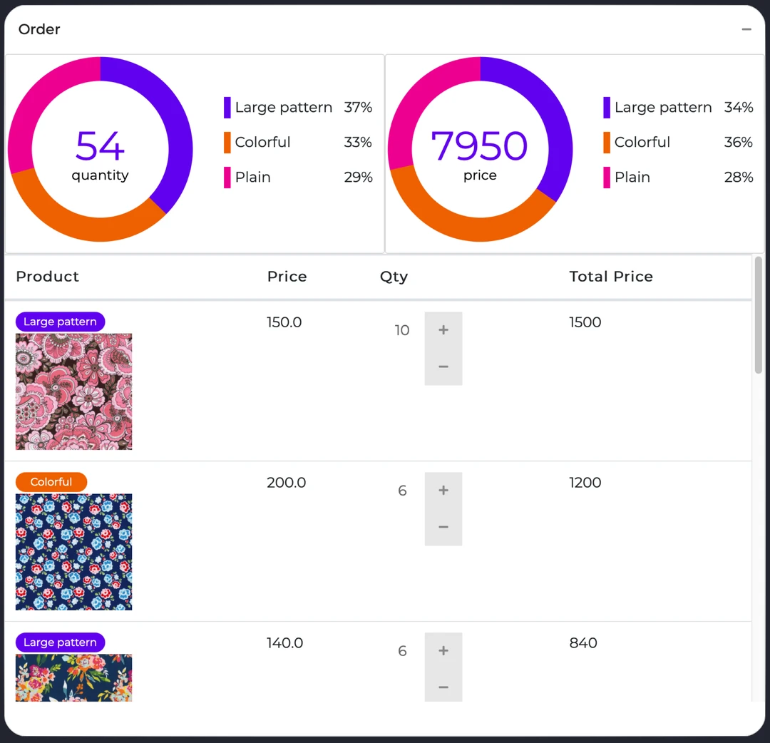
Firstly, by implementing tags such as “Colorful,” “Large Pattern,” and “Plain” in our in-house library and dashboard, as shown in Fig. 9, buyers can have a clearer summary of each category. This enables them to make decisions more confidently and efficiently.
Example of an in-house library and dashboard that is integrated with tags from cluster analysis.
Previously, we only made purchases in Q1 and Q3, while fabric sales were limited to Q2 and Q4, as indicated by the 2017 results in Fig. 10. However, after the implementation, we were able to make purchases and sales in all four quarters. In other words, the processing time for each purchase has been reduced from six months to three months.
Secondly, we can allocate our budget more effectively by being more cautious with our purchases of “Plain” fabric and investing in other fabrics instead. By comparing fabric sales in 2017/Q4 and 2018/Q1, we have observed an improvement of 2.73.
Fabric sales per quarter have been tracked since 2017. Since 2018, the purchase process has incorporated the results of cluster analysis, which has led to higher sales. Different colors indicate the before and after implementation.
7. Conclusion
By using K-means, we divided the fabric from the previous quarter’s sales into three categories. We discovered that high inventory levels were due to fabrics with a monochrome color theme, high percentage of the main color, low contrast, and small pattern size. We collectively refer to this type of fabric as “Plain” fabric. While we have not been able to predict sales, categorizing fabric into these categories has proven to be one of the main factors in improving our sales.
Reference
- Ferrari & Cribari-Neto (2004)
- Ferrari, S. & Cribari-Neto, F. (2004). Beta regression for modelling rates and proportions. Journal of applied statistics, 31(7). 799–815.